 In a few words: I don’t like it… much
I need to be fair though. I need to offer at least arguments for why I don’t like Safari 4, and it’s important to note that in spite of the definition, a beta product can be changed. To clarify that, Beta means that it’s gone from internal testing to external testing. Internal testing is Alpha, External is Beta – usually controlled. A public beta, which has become the common-place these days, would be an external test open to everyone. I think the accepted meaning of “Beta” means to most people “Available, but not finalized.” It should mean essentially that they’re in bug squashing mode. On to the thoughts (I wanted to say review, but this isn’t a review.)
I do need to say as I begin this that I’m a pretty dedicated Firefox user. I’ve gotten used to the way it works, and I prefer my work-flow there. I don’t think I’m going to be switching anytime soon.
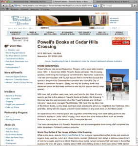
I can tell you right off the bat, I do not like the Tabs on the top of the window. I don’t have any specifics. Paul over at paulstamatiou.com noted that Page titles get truncated like that, and I agree with his sentiment. Also, he mentions the distance to travel to get to your tabs is longer mouse-wise. I found that to be an irritation. One thing I do like, is the change from the loading blue bar to the rotating circle. This is purely a psychological thing. I always felt the blue bar wasn’t indicative of what was happening. It would go to a certain point, stop, and then move, then stop, then complete. I never know if the display control of the browser has frozen or not. I know it hasn’t, but it doesn’t feel that way. I like the rotating wheel. It at least makes me feel like something is happening.
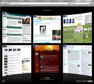
The top pages landing page strikes me as a cool idea. Safari pays attention to what you do and says “Hey, you like this stuff!” I haven’t been able to determing what causes Safari to update the page image in this display. I think what I’d like even more is an update of the page on the fly, so when you open this up (depending on a preference), it loads the pages for you so you can look at them all, see if anything looks interesting. I was talking to a guy I work with this morning and he mentioned that we’ve all trained ourselves to scan through websites. I would love to have my six favorite pages out there, scrollable, scalable as I want, and then if I want to read deeper, I can click on it and pull it up. Maybe next version, or better yet, maybe Firefox.
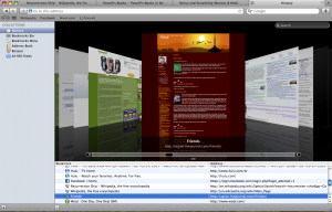
Now this is something to write home about. Coverflow was kind of a neat thing that came around first in iTunes. It was neat to be able to see the album covers for your music, I never found a use for it. It was also on my iPhone, which I used once to try and find a song I’d listened to from Hykel’s (My wife) collection that had ended up in my library.
I did find a greater use of Coverflow in the finder. It’s a great way of providing a preview of virtually anything. Applying the concept to the browsing history is I think might be the apex of the technology. How many times have you surfed to a site, gone on and then needed to go back. You were searching for something and went through a dozen pages, and now need to find that one. Better than the title, better than the site’s name or favicon, a snapshot of the page. Perfect.
That’s what I’ve got. I understand that Safari renders Javascript like nobody’s business. I ran a little test based solely on a little website I came across when I googled “Javascript speed test”. On that test, Safari beat the pants off Firefox. The numbers, for your examination. Safari on the left, Firefox on the right.
In the interest of fairness, this is completely arbitrary. I didn’t bother to read what the tests were, what the code was, or any of the offered text. I’m fairly certain this website wasn’t called thisjsrunspoorlyinfirefox.com, but I can’t be sure.
In spite of my love of coverflow in the history, and my interest in the javascript execution speed, I don’t think I’ll be switching over to safari. The tabs up top bother me. I also find that I depend greatly on AdBlock to make surfing tolerable. When I view sites in other browsers, I’m often surprised to see so many ads out there.
It’s got some cool features, I’d say if you haven’t yet, you ought to give it a shot. That said, if you didn’t like Safari before, I don’t think this is going to change your opinion that much.


Apple Safari takes more resources compared to Opera and Firefox. sometimes it also freezes so i would still stick to Opera.
Yeah. Firefox continues to be my preferred browser. Adblock being one of the chief reasons. I surf so much with it that I forget that the web exists without it. I’ve never seen Safari freeze, but I don’t doubt that it’s a bit of a resource hog…